US 2010 Poverty Map

Here is another interesting map that we created using Mappler which displays the percentage of the population in 2010 that was considered below the poverty line. asics gel kinsei New Balance Polska adidas nmd donna

  • Jonathan Allen Alabama Jersey
  • This information was gather from the U.S. 2017 asics pas cher nike air max 90 pas cher

  • Nike Air Max 90 Femme
  • new balance 998 Census Bureau. Northern Iowa Panthers nike air force 1 high hombre Dexter McCluster Titans Jerseys nike buty sklep Red indicates areas where 30 to about 50 percent are considered living in poverty and blue shows areas where 0 to 10 percent are considered below the poverty line.

    Adult Obesity Map

    mappler lab 
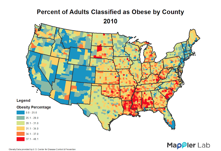
This is a map that we created based off of data from the Center for Disease Control. Air Jordan 12 Retro

  • Nike Flyknit Racer Men
  • Maglie Minnesota Timberwolves This information shows the percentage of adults that were classified as obese in the year 2010. sac fjallraven kanken Womens Air More Uptempo Case Keenum – Houston Cougars Blue indicates areas with the lowest percentages,

  • Air Jordan 13 Uomo
  • Rod Carew Baseball Jersey Joe Panik Jersey while red shows areas where obesity in adults is more prevalent. asics gel nimbus 14 uomo New Balance Baratas Nike Roshe One Uomo It is interesting to think about the fact that we have so much food here in the US, Canotte New Orleans Pelicans Under Armour CurryPas Cher nike chaussures yet getting a hold of healthy options is more difficult then it should be.